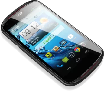
Mobile phones, tablets and all manner of different devices can be a nightmare for any web developer. Have you ever wondered what your site looks like on a mobile phone like the iPhone? How about on different sized desktops or notepads?
Here are just a TINY selection of the sizes currently out there!
DESKTOPS
10″ Netbook 1024 x 600
12″ Netbook 1024 x 768
13″ Notebook 1280 x 800
15″ Notebook 1366 x 768
19″ Desktop 1440 x 900
20″ Desktop 1600 x 900
22″ Desktop 1680 x 1050
23″ Desktop 1920 x 1080
24″ Desktop 1920 x 1200
MOBILES
Motorola RAZR V3m 176 x 220
Motorola RAZR V8 240 x 320
BlackBerry 8300 320 x 240
Apple iPhone 3 320 x 480
Apple iPhone 4 320 x 480 / Retina
LG Optimus S 320 x 480
Google Nexus S 480 x 800
ASUS Galaxy 7 480 x 800
TABLETS
ViewSonic ViewPad 800 x 480
Velocity Cruz 800 x 600
Samsung Galaxy 1024 x 600
Apple iPad 1&2 1024 x 768
Motorola Xoom 1280 x 800
TELEVISIONS
480p Television 640 x 480
720p Television 1280 x 720
1080p Television 1920 x 1080
If you are a Google Chrome user you may also like Window Resizer Pro, an extension packed with useful smart phone sizes.
Or visit Quirk Tools useful Screenfly page to test any URL for any smart phone, tablet or desktop – even TV!